RS Aggarwal Solutions Class 9 Chapter 14 Statistics Solution
EXERCISE 14C
Question 1:
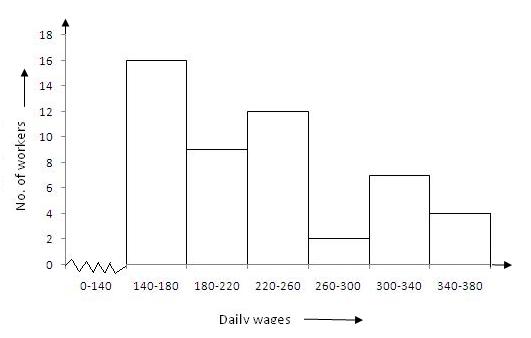
Given frequency distribution is as below :
| Daily wages (in Rs) | 140-180 | 180-220 | 220-260 | 260-300 | 300-340 | 340-380 |
| No. of workers | 16 | 9 | 12 | 2 | 7 | 4 |
In the class intervals, if the upper limit of one class is the lower limit of the
next class, it is known as the exclusive method of classification.
Clearly, the given frequency distribution is in the exclusive form.
To draw the required histogram , take class intervals , i.e. daily wages (in Rs. )
along x-axis and frequencies i.e.no. of workers along y-axis and draw rectangles .
So , we get the required histogram .
Since the scale on X-axis starts at 140, a kink(break) is indicated near the origin
to show that the graph is drawn to scale beginning at 140.
Question 2:
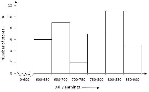
Given frequency distribution is as below :
|
Daily earnings (in Rs) |
600-650 | 650-700 | 700-750 | 750-800 | 800-850 | 850-900 |
| No of stores | 6 | 9 | 2 | 7 | 11 |
5 |
In the class intervals, if the upper limit of one class is the lower limit of the
next class, it is known as the exclusive method of classification.
Clearly, the given frequency distribution is in the exclusive form.
We take class intervals, i.e. daily earnings (in Rs .) along x-axis and frequencies
i.e. number of stores along y-axis. So , we get the required histogram .
Since the scale on X-axis starts at 600, a kink(break) is indicated near the origin
to show that the graph is drawn to scale beginning at 600.
Question 3:
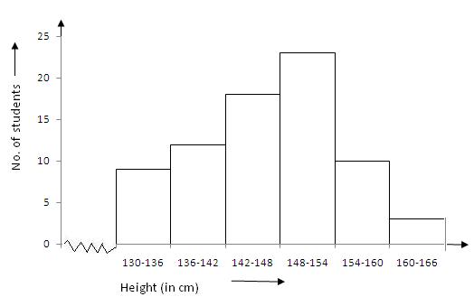
Give frequency distribution is as below :
|
Height (in cm) |
130-136 | 136-142 | 142-148 | 148-154 | 154-160 | 160-166 |
| No. of students | 9 | 12 | 18 | 23 | 10 |
3 |
In the class intervals, if the upper limit of one class is the lower limit of the
next class, it is known as the exclusive method of classification.
Clearly, the given frequency distribution is in the exclusive form.
We take class intervals, i.e. height (in cm ) along x-axis and frequencies i.e.
number of student s along y-axis . So we get the required histogram.
Since the scale on X-axis starts at 130, a kink(break) is indicated near the origin
to show that the graph is drawn to scale beginning at 130.
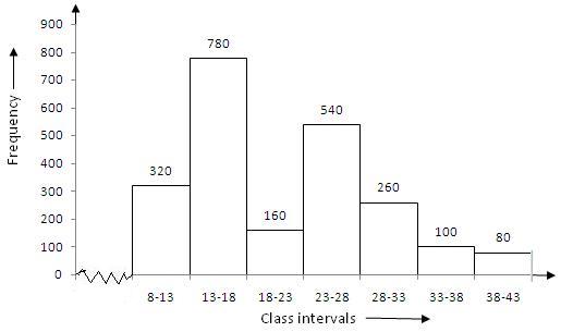
Question 4:
Give frequency distribution is as below :
|
Class Interval |
8-13 | 13-18 | 18-23 | 23-28 | 28-33 | 33-38 | 38-43 |
|
Frequency |
320 | 780 | 160 | 540 | 260 | 100 |
80 |
In the class intervals, if the upper limit of one class is the lower limit of the
next class, it is known as the exclusive method of classification.
Clearly, the given frequency distribution is in the exclusive form.
We take class intervals along x-axis and frequency along y-axis . So , we get the
required histogram.
Since the scale on X-axis starts at 8, a kink(break) is indicated near the origin to
show that the graph is drawn to scale beginning at 8.
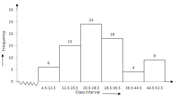
Question 5:
Histogram is the graphical representation of a frequency distribution in the form of
rectangles, such that there is no gap between any two successive rectangles.
Clearly the given frequency distribution is in inclusive form, that is there is a
gap between the upper limit of a class and the lower limit of the next class.
Therefore, we need to convert the given frequency distribution into exclusive form,
as shown below:
|
Class Interval |
4.5-12.5 | 12.5-20.5 | 20.5-28.5 | 28.5-36.5 | 36.5-44.5 | 44.5-52.5 |
| Frequency | 6 | 15 | 24 | 18 | 4 |
9 |
To draw the required histogram , take class intervals, along x-axis and frequencies
along y-axis and draw rectangles . So, we get the required histogram .
Since the scale on X-axis starts at 4.5, a kink(break) is indicated near the origin
to show that the graph is drawn to scale beginning at 4.5.
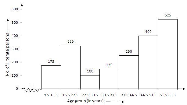
Question 6:
Given frequency distribution is as below :
|
Age group (in years ) |
10-16 | 17-23 | 24-30 | 31-37 | 38-44 | 45-51 | 52-58 |
| No. of Illiterate persons | 175 | 325 | 100 | 150 | 250 | 400 |
525 |
Histogram is the graphical representation of a frequency distribution in the form of
rectangles, such that there is no gap between any two successive rectangles.
Clearly the given frequency distribution is in inclusive form, that is there is a
gap between the upper limit of a class and the lower limit of the next class.
Therefore, we need to convert the frequency distribution in exclusive form, as shown
below:
|
Age group(in years) |
9.5-16.5 | 16.5-23.5 | 23.5-30.5 | 30.5-37.5 | 37.5-44.4 | 44.5-51.5 | 51.5-58.5 |
|
No of Illiterate persons |
175 | 325 | 100 | 150 | 250 | 400 |
525 |
To draw the required histogram , take class intervals, that is age group, along
x-axis and frequencies, that is number of illiterate persons along y-axis and draw
rectangles . So , we get the required histogram.
Since the scale on X-axis starts at 9.5, a kink(break) is indicated near the origin
to show that the graph is drawn to scale beginning at 9.5.
Question 7:
Given frequency distribution is as below :
|
Class Interval |
10-14 | 14-20 | 20-32 | 32-52 | 52-80 |
| Frequency | 5 | 6 | 9 | 25 |
21 |
In the above table , class intervals are of unequal size, so we calculate the
adjusted frequency by using the following formula :
\(Adjusted\quad Frequency=\frac { Minimum\quad class\quad size\quad \times \quad
its\quad frequency }{ Class\quad size\quad of\quad this\quad class } \)
Thus , the adjusted frequency table is
| Class Intervals | Frequency | Adjusted Frequency |
| 10 – 14 | 5 | \(\frac { 4 }{ 4 } \times 5=5 \) |
| 14 – 20 | 6 | \(\frac { 4 }{ 6 } \times 6=4 \) |
| 20 – 32 | 9 | \(\frac { 4 }{ 12 } \times 9=3 \) |
| 32 – 52 | 25 | \(\frac { 4 }{ 20 } \times 25=5 \) |
| 52 – 80 | 21 | \(\frac { 4 }{ 28 } \times 21=3 \) |
Now take class intervals along x-axis and adjusted frequency along y-axis and
constant rectangles having their bases as class-size and heights as the
corresponding adjusted frequencies.
Thus, we obtain the histogram as shown below:

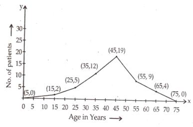
Question 8:
The given frequency distribution is as below:
|
Age in years |
10-20 | 20-30 | 30-40 | 40-50 | 50-60 | 60-70 |
| No of patients | 2 | 5 | 12 | 19 | 9 |
4 |
In order to draw, frequency polygon, we require class marks.
The class mark of a class interval is: \(\frac { upper\quad limit\quad +\quad
lower\quad limit }{ 2 } \)
The frequency distribution table with class marks is given below:
| Class Intervals | Class Marks | Frequency |
| 0 – 10 | 5 | 0 |
| 10 – 20 | 15 | 2 |
| 20 – 30 | 25 | 5 |
| 30 – 40 | 35 | 12 |
| 40 – 50 | 45 | 19 |
| 50 – 60 | 55 | 9 |
| 60 – 70 | 65 | 4 |
| 70 – 80 | 75 | 0 |
In the above table, we have taken imaginary class intervals 0-10 at beginning and
70-80 at the end, each with frequency zero . Now take class marks along x-axis and
the corresponding frequencies along y-axis.
Plot points (5,0), (15,2), (25, 5), (35, 12), (45, 19), (55, 9), (65, 4) and (75, 0)
and draw line segments.
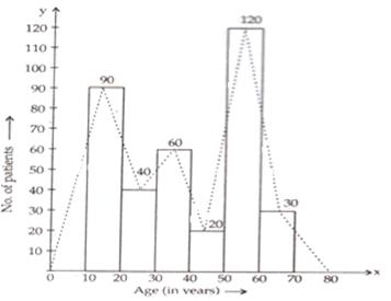
Question 9:
The given frequency distribution is as below
|
Age in years |
10-20 | 20-30 | 30-40 | 40-50 | 50-60 | 60-70 |
| Numbers of patients | 90 | 40 | 60 | 20 | 120 |
30 |
Take class intervals i.e age in years along x-axis and number of patients of width
equal to the size of the class intervals and height equal to the corresponding
frequencies.
Thus we get the required histogram.
In order to draw frequency polygon, we take imaginary intervals 0-10 at the
beginning and 70-80 at the end each with frequency zero and join the mid-points of
top of the rectangles.
Thus, we obtain a complete frequency polygon, shown below:
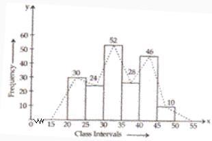
Question 10:
The given frequency distribution is as below :
|
Class Intervals |
20-25 | 25-30 | 30-35 | 35-40 | 40-45 | 45-50 |
|
Frequency |
30 | 24 | 52 | 28 | 46 |
10 |
Take class intervals along x-axis and frequencies along y-axis and draw rectangle s
of width equal to the size of the class intervals and heights equal to the
corresponding frequencies.
Thus we get required histogram.
Now take imaginary class intervals 15-20 at the beginning and 50-55 at the end ,
each with frequency zero and join the mid points of top of the rectangles to get the
required frequency polygon.
Question 11:
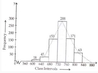
The given frequency distribution table is given below :
|
Class Interval |
600-640 | 640-680 | 680-720 | 720-760 | 760-800 | 800-840 |
| Frequency | 18 | 45 | 153 | 288 | 171 |
63 |
Take class intervals along x-axis and frequencies along y-axis and draw rectangles of
width equal to to size of class intervals and height equal to their corresponding
frequencies.
Thus we get the required histogram.
Take imaginary class intervals 560-600 at the beginning and 840-880 at the end, each
with frequency zero.
Now join the mid points of the top of the rectangles to get the required frequency
polygon.
Question 12:
The given frequency distribution table is as below:
|
Class Intervals |
1-10 | 11-20 | 21-30 | 31-40 | 41-50 | 51-60 |
| Frequency | 8 | 3 | 6 | 12 | 2 |
7 |
This table has inclusive class intervals and so these are
to be converted into exclusive class intervals (i.e true class limits).
These are (0.5-10.5), (10.5-20.5), (20.5-30.5), (30.5-40.5), (40.5-50.5), and
(50.5-60.5)
In order to draw a frequency polygon, we need to determine the class marks. Class
marks of a class interval = \(\frac { upper\quad limit\quad +\quad lower\quad limit
}{ 2 } \)
Take imaginary class interval ( -9.5-0.5) at the beginning and (60.5-70.5) at the
end , each with frequency zero. So we have the following table
|
Class Intervals |
True class Intervals | Class marks | Frequency |
| (-9)-0
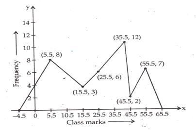
1-10 11-20 21-30 31-40 41-50 51-60 61-70 |
(-9.5)-0.5
0.5-10.5 10.5-20.5 20.5-30.5 30.5-40.5 40.5-50.5 50.5-60.5 60.5-70.5 |
-4.5
5.5 15.5 25.5 35.5 45.5 55.5 65.5 |
0 8 3 6 12 2 7 0 |
Now, take class marks along x-axis and their corresponding
frequencies along y-axis.
Mark the points and join them.
Thus, we obtain a complete frequency polygon as shown below: